BIBLIOTECA OBLATE


SPRING 2022
BRAND IDENTITY
ADVISOR:SILVIA AGOZZINO
BRAND IDENTITY
ADVISOR:SILVIA AGOZZINO
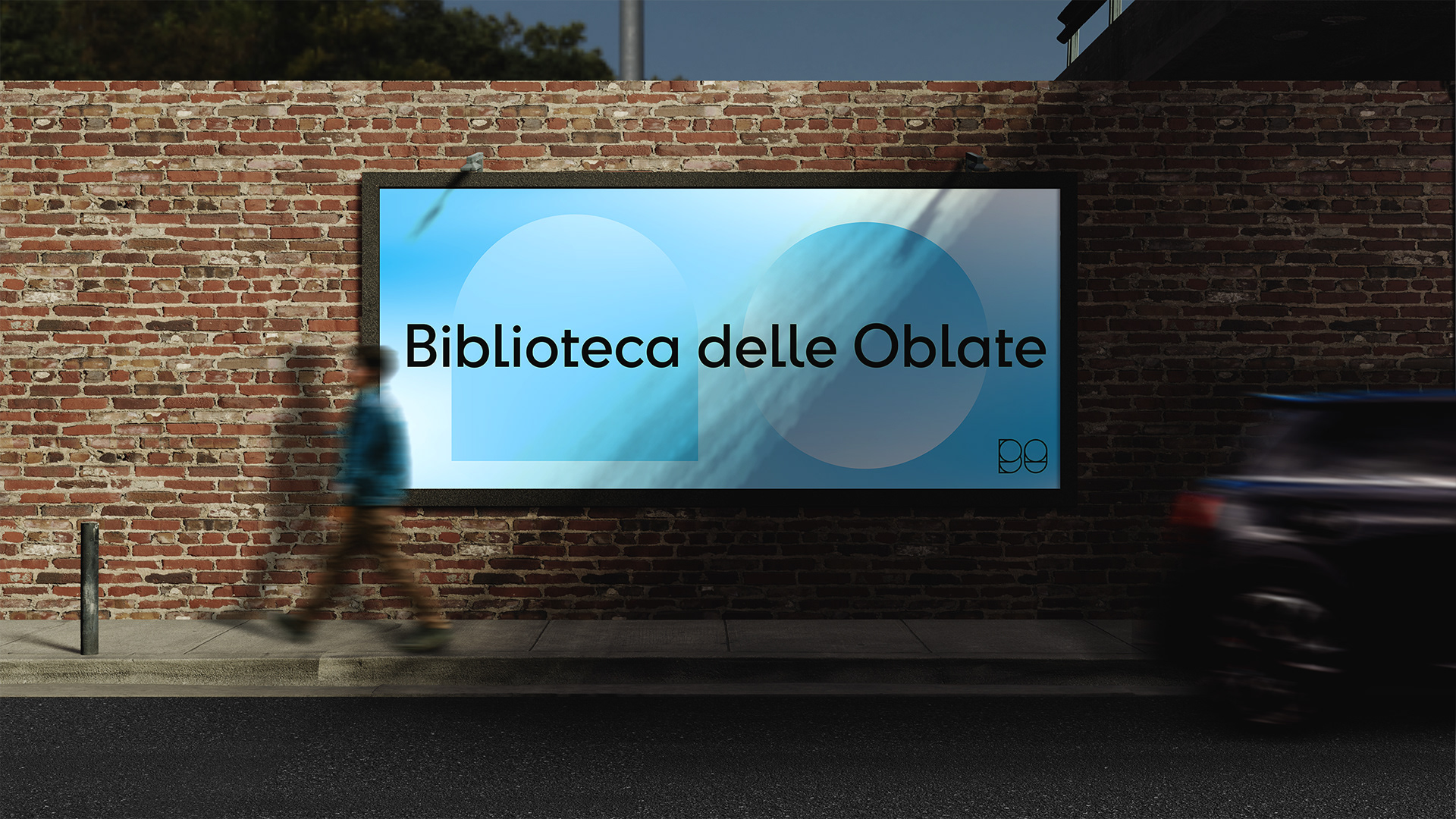
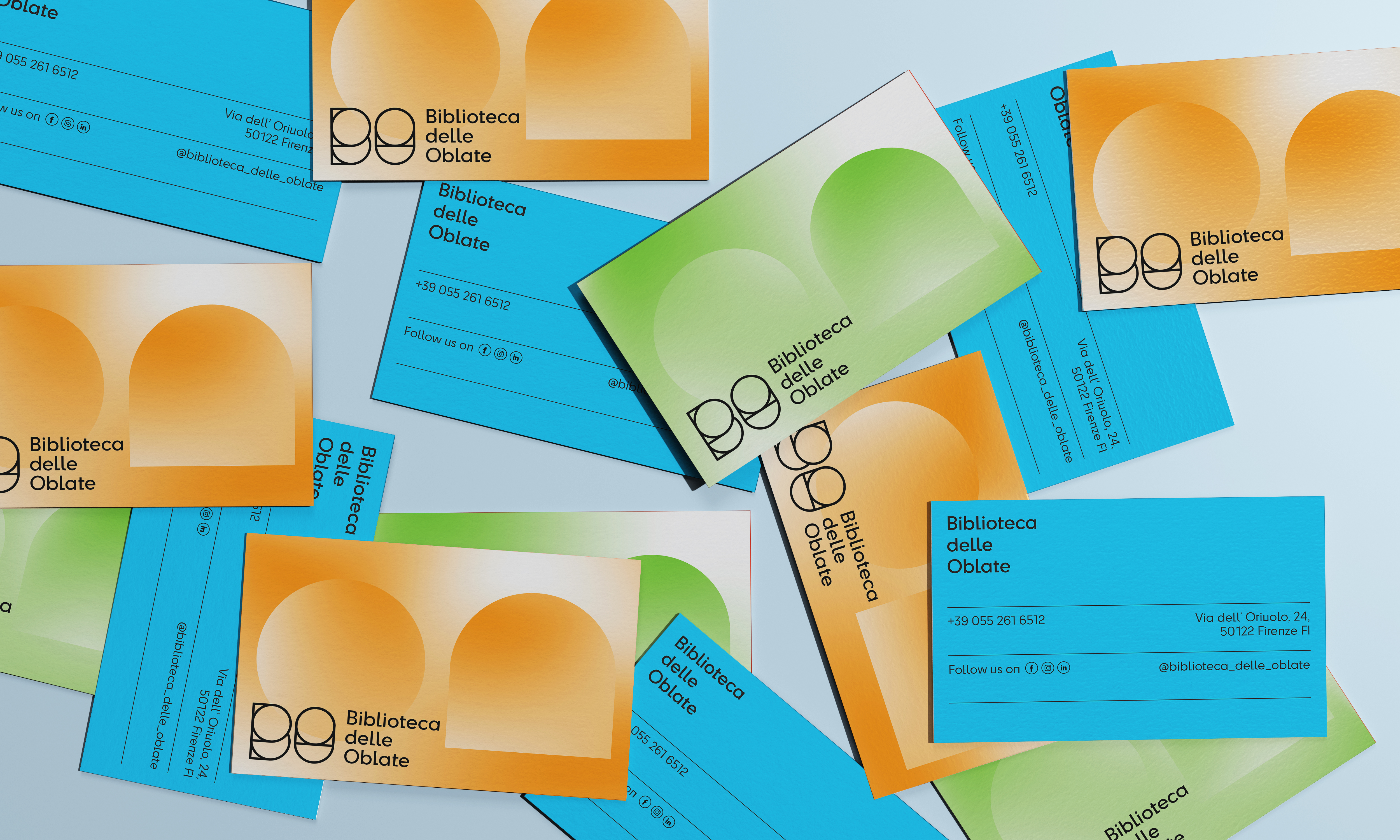
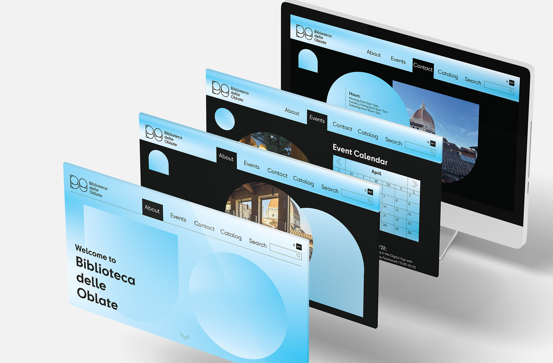
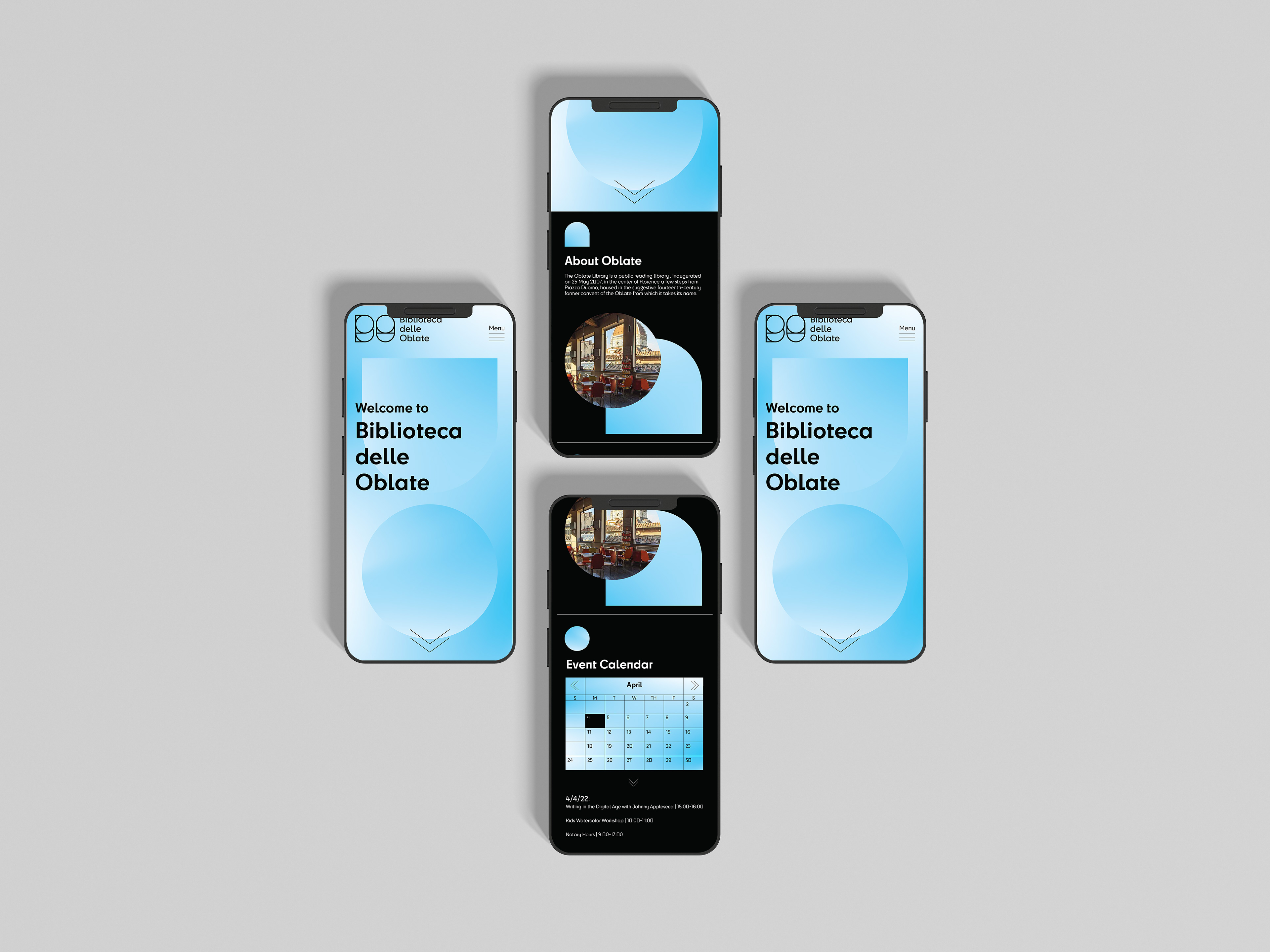
As the main public library of Florence, Biblioteca delle Oblate is a cultural hub, study space, and host of various events. The history of the library is deeply engrained in the city, started by a group of female nurses, the Oblate Order, who created a hospital for the sick.


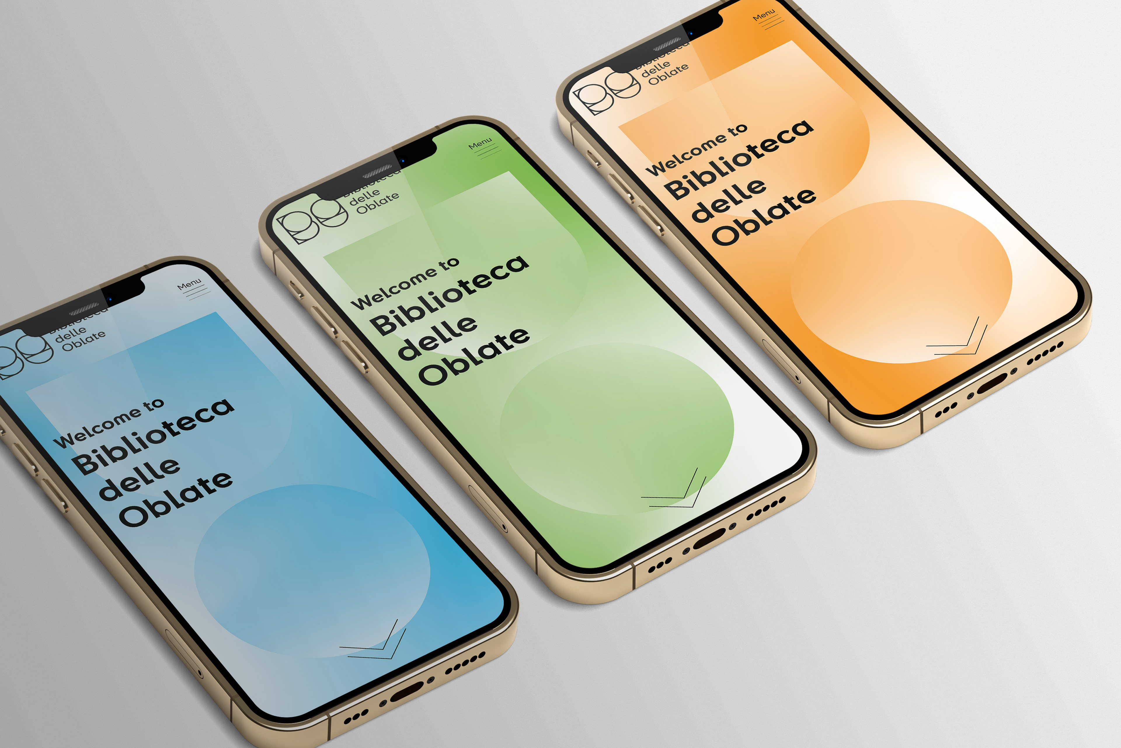
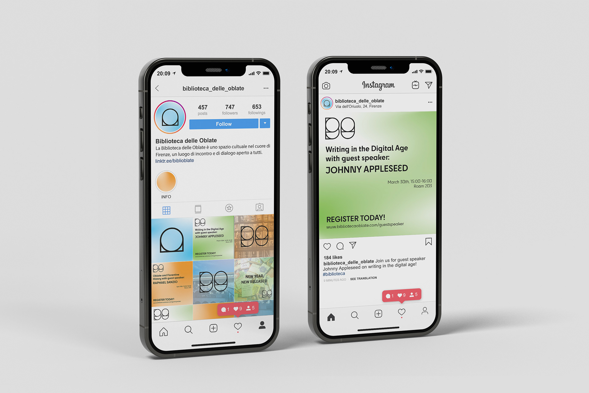
This identity uses geometric shapes and color to represent the physical and cultural aspects of Oblate’s role in the city. The core shape of a circle within an arch echoes the design of the building itself as well as the surrounding architectural landscape of Florence. The whimsical gradient usage refurbishes the existing color system to appeal to the younger audience that Oblate is a primary space for.
Logo Iterations + Process